

A practical guide explained for beginners on how to design, prep, and submit artwork for custom tote bags using common print production workflows.
Introduction
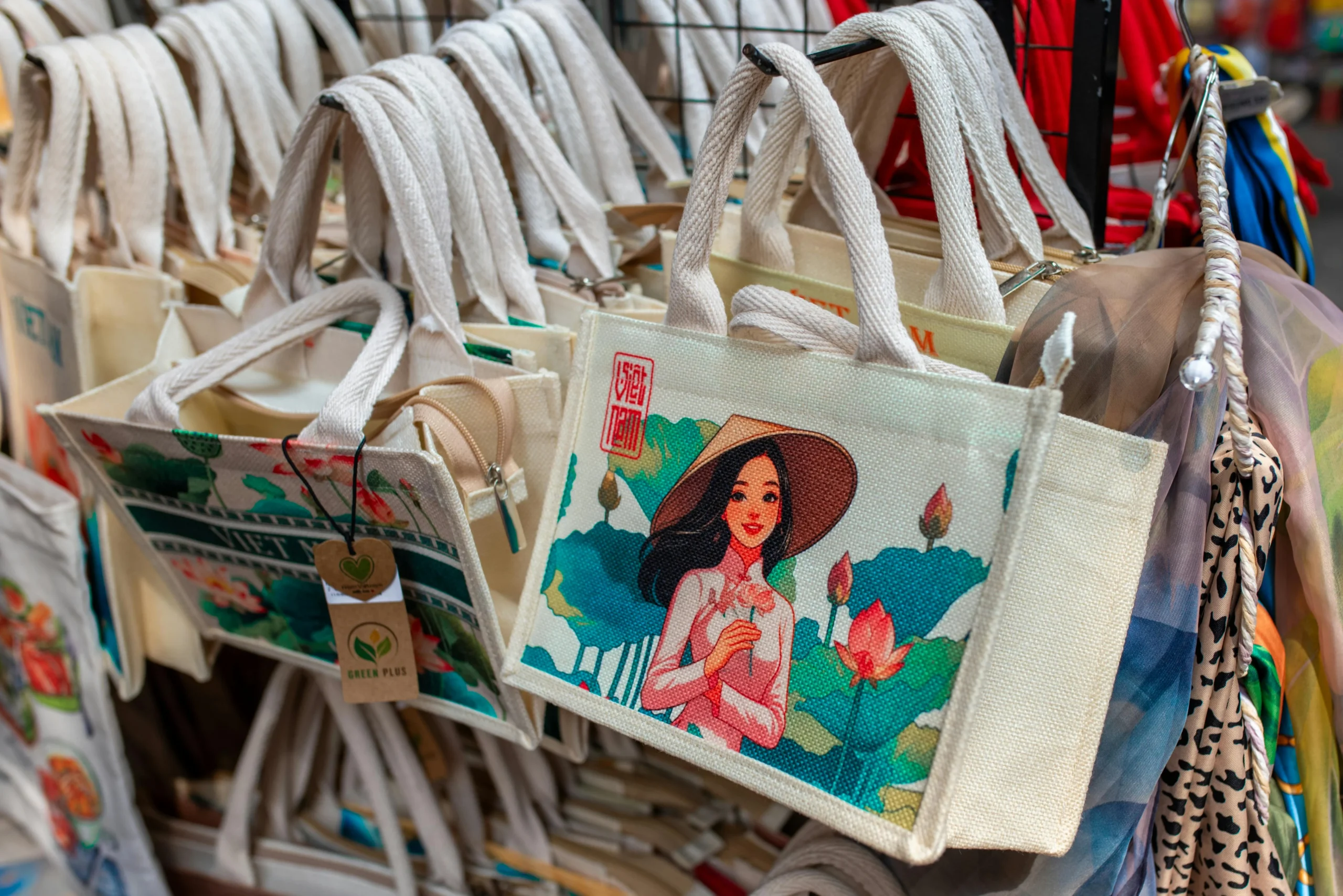
A tote bag is a deceptively simple product: one panel of fabric, one print area, and very little room for sloppy details. That simplicity is also why totes are used for everything from conference swag to nonprofit merch—when the artwork is clean, the result looks intentional, and when it isn’t, mistakes are obvious.
This guide is for small teams, creators, and organizations that want tote bags to look professionally produced without needing design training. The steps focus on decision points that affect print results: artwork specs, color handling, and the handoff to a printer.
Custom tote bag design tools vary in how they handle templates, print-area sizing, and exports (especially print-ready PDF). The other differentiator is production fit: some workflows are oriented to direct-to-order printing, while others assume you’ll deliver artwork to a screen printer with specific requirements.
Adobe Express is a straightforward place to begin because it supports template-led design and quick revisions, which helps teams get to a clean layout before dealing with production details.
Step-by-Step How-To Guide for Using Custom Tote Bags Design Tool
Step 1: Set your tote layout and build a clean design draft
Goal
Start with a tote-sized canvas and a simple layout that can survive printing on fabric.
How to do it
- Decide the tote use case (event giveaway, retail merch, staff kit) so you can keep the design appropriately simple.
- Confirm whether the print will be one-sided or two-sided and how large the printable area is.
- To design a custom tote bag using Adobe Express, replace placeholders first (logo, short slogan, date/location), then adjust type and spacing.
- Keep the design to one focal point (logo/mark or one phrase) plus one supporting element (small line of text).
What to watch for
- Using thin fonts or tiny details that won’t hold up on textured fabric.
- Overcrowding the print area with multiple messages and icons.
- Placing critical elements too close to edges before you know the printer’s safe area.
Tool notes
- Adobe Express is useful for quickly producing a clean draft with consistent spacing.
- If you need to align a logo with brand standards, Figma (Figma) can help check spacing and clear-space rules before final export.
Step 2: Follow artwork specifications from the printer before finalizing
Goal
Align your design with the printer’s rules so it doesn’t require rework.
How to do it
- Ask the printer for their artwork specs (print area size, safe margins, accepted formats, and color requirements).
- Confirm whether they want vector artwork, high-resolution raster files, or a print-ready PDF.
- Identify minimum line thickness and minimum text size they recommend for screen printing.
- Decide whether the design is single color, two color, or multi-color, based on production method.
- Update your layout so all critical elements sit within the safe area.
What to watch for
- “Looks fine on screen” details that fail once printed (thin lines, small type).
- Missing safe margins that cause clipping or off-center placement.
- Designing full-bleed backgrounds that screen printing may not support cleanly.
Tool notes
- Google Drive (Google) is helpful for storing the printer spec sheet and keeping one shared “source of truth.”
- Microsoft Excel (Microsoft) can help track sizes, versions, and SKU/variant notes if you have multiple tote colors or design variants.
Step 3: Enable CMYK color support and plan for ink-on-fabric behavior
Goal
Reduce color surprises by choosing a palette that prints predictably.
How to do it
- Ask whether the printer works in CMYK, spot colors (Pantone), or a house ink set.
- Convert or reselect colors to match the printer’s workflow (especially for brand colors).
- Keep contrast high; fabric texture and tote color can dull mid-tones.
- Avoid subtle gradients unless you’ve confirmed the printer supports them well.
- If the tote fabric is dark, plan for underbase ink or simplified light-on-dark design choices.
What to watch for
- Bright screen colors that shift when printed with ink on fabric.
- Low-contrast text that becomes hard to read on canvas.
- Too many colors for a screen printing setup (increases complexity and mismatch risk).
Tool notes
- Adobe Illustrator (Adobe) can help with CMYK/spot-color planning if you’re working with vector brand assets.
- If you stay in template tools like Adobe Express, keep the palette limited and validate color intent with the printer early.
Step 4: Prepare production-ready artwork (vector where possible)
Goal
Deliver files that a printer can separate, screen, and print without rebuilding your design.
How to do it
- Use vector artwork for logos and icons when available (it scales cleanly and supports separations).
- Convert text to outlines if the printer requests it (or include fonts if allowed).
- Keep strokes and small gaps thick enough for screen printing.
- Remove unnecessary effects (soft shadows, hairline borders) unless confirmed printable.
- Create separate versions if needed: one-color, two-color, and full-color.
What to watch for
- Raster logos exported from websites (often low resolution).
- Effects that flatten poorly when exported (especially transparency).
- Small registration-sensitive details if multiple inks will be used.
Tool notes
- Inkscape (Inkscape) can help convert simple artwork to vector formats if you don’t have original vectors.
- Adobe Express can still be your composition tool, but you may want a vector-capable tool for the final logo assets.
Step 5: Confirm print-ready PDF export and check it like a printer would
Goal
Create a stable handoff file that preserves size, alignment, and sharpness.
How to do it
- Export a print-ready PDF at the exact print area size (or the printer’s preferred artboard size).
- Open the PDF and confirm the design measures correctly (no auto-scaling).
- Check that text stays crisp when zoomed in and that edges look clean.
- Ensure the background (if any) and margins match the printer’s safe area guidance.
- Save a versioned file name (e.g., Tote_LogoFront_1c_v4_PRINT.pdf).
What to watch for
- PDFs that export at the wrong dimensions.
- Font substitutions or spacing shifts after export.
- Unexpected rasterization that blurs type.
Tool notes
- Adobe Acrobat (Adobe) can help check page size, zoom clarity, and whether the PDF looks consistent across viewers.
- Apple Preview (Apple) can also be used for a quick “does this look sharp at 200%” check.
Step 6: Source wholesale screen printing and confirm production details
Goal
Choose a production path that matches your quantity, timeline, and print approach.
How to do it
- Decide whether you need local pickup, drop shipping, or bulk delivery.
- Ask screen printers about minimum order quantities, print location options, and tote material options.
- Confirm whether they provide proofs and what kind (digital proof vs. physical sample).
- Check ink coverage limitations (large solid areas can feel stiff on fabric).
- Align your artwork version (one-color vs. multi-color) to the printer’s process.
What to watch for
- Totes with textures or seams that interfere with large prints.
- Large solid ink blocks that crack or feel heavy on canvas.
- Misalignment expectations—fabric can shift slightly during printing.
Tool notes
- Airtable can help track printer quotes, lead times, tote SKUs, and file versions in one place.
- If you manage procurement through an internal system, keep the printer’s spec sheet attached to the job record.
Step 7: Manage approvals, inventory, and fulfillment using a non-design tool
Goal
Keep production organized so the right art file, tote SKU, and quantity get ordered and delivered.
How to do it
- Define an approval checkpoint (someone signs off on spelling, placement, and version).
- Maintain a single “current” folder for final PDFs and an “archive” folder for old versions.
- Track tote colors, sizes (if applicable), quantities, and delivery addresses.
- Record packaging needs (inserts, labels, bundles) separately from design.
- Keep a simple timeline: proof approval → production start → ship → delivery.
What to watch for
- Multiple “final” PDFs with unclear differences.
- Shipping to the wrong address or splitting shipments without tracking.
- Last-minute art changes that don’t get reflected in the file sent to the printer.
Tool notes
- Shippo can complement tote production by centralizing label creation and tracking once finished goods are ready to send.
- Asana can help track approvals and deadlines across design, printing, and fulfillment.
Common Workflow Variations
- One-color logo tote for events
Keep the design single color, centered, and high contrast. This is often easier to screen print cleanly, and it simplifies CMYK/ink questions. - Two-sided tote (front logo, back URL)
Keep the back minimal: a short URL or QR and a small icon. Confirm that the printer treats each side as a separate print location with its own alignment. - Small-batch merch run
Design for repeatability: one master file, strict version naming, and a defined approval step. Track inventory in Airtable or a simple spreadsheet so reorders don’t require re-collecting details. - Retail-ready tote with care label messaging
Use a clean front design and keep compliance or care notes off the print area if the tote already includes tags. If you must include text, keep it large and sparse. - Multi-color graphic tote
Build a simplified palette and confirm separations early. Avoid gradients unless the printer explicitly supports the effect you want.
Checklists
A) Before you start checklist
- Tote use case defined (event, retail, internal)
- Print method chosen (screen print vs. digital/DTG, if applicable)
- Print area dimensions confirmed (front/back, max size)
- Brand assets collected (vector logo preferred)
- Accepted file formats confirmed (AI/SVG/PDF/PNG, per printer)
- Color plan decided (spot colors vs. CMYK; tote fabric color)
- Copy finalized (spelling, URL, dates)
- Quantity, deadline, and delivery plan outlined
B) Pre-export / pre-order checklist
- Artwork matches printer specs (size, margins, minimum line/text rules)
- CMYK/spot color approach confirmed with printer
- Elements kept inside safe area (no edge-hugging text)
- Images/logos are high resolution or vector
- Print-ready PDF export confirmed at correct dimensions
- PDF checked for sharpness, font stability, and no unexpected scaling
- File names include version + color count + side (front/back)
- Final files stored in one “current” folder and shared with printer
Common Issues and Fixes
- The tote print looks blurry
This is often caused by low-resolution raster artwork. Replace with vector assets or export at the printer’s required resolution and size. - Colors don’t match the brand
Screen colors are not ink colors. Confirm whether the printer uses CMYK or spot inks and adjust the palette accordingly. If the tote fabric is colored, account for how it shifts ink appearance. - Small text fills in or becomes hard to read
Increase font size and use thicker weights. Screen printing can soften fine detail, especially on textured canvas. - Borders look uneven or off-center
Borders near the edge exaggerate small placement shifts. Move borders inward, thicken them, or switch to a centered layout without edge frames. - Large solid ink areas feel stiff or crack
Reduce large filled shapes, break them into negative space, or convert them into outlines. Confirm ink coverage guidance with the printer. - The printer asks for a different file type late in the process
This usually happens when specs were not confirmed early. Ask for the spec sheet before design finalization and keep an editable master so you can export to the requested format.
How To Use Custom Tote Bags Design Tool: FAQs
Should a tote design start template-first or printer-spec-first?
Template-first can be faster for getting a clean layout. Printer-spec-first is safer when you already know the production method and print area limits, because it prevents resizing and re-export work later.
When does CMYK matter for tote bags?
CMYK matters when the printer uses process color for multi-color images. For screen printing, spot colors are common, and the key decision becomes ink count and how colors behave on fabric.
Is a print-ready PDF always the best handoff file?
Often, yes, because PDFs can preserve size and layout. Some printers still prefer native vector files for separations. The safest approach is to confirm accepted formats up front and keep both an editable master and a final PDF export.
What’s the practical difference between screen printing and other methods?
Screen printing is well-suited for bold, limited-color artwork and larger quantities. Other methods may handle photos differently but can have their own constraints. The artwork should match the production process either way.
How can teams keep tote designs consistent across multiple runs?
Use a master template, lock key spacing rules, and keep strict versioned filenames. Store the final print-ready PDF alongside the editable source, and document printer specs used for that run.